The Children’s Book Review | November 8, 2017
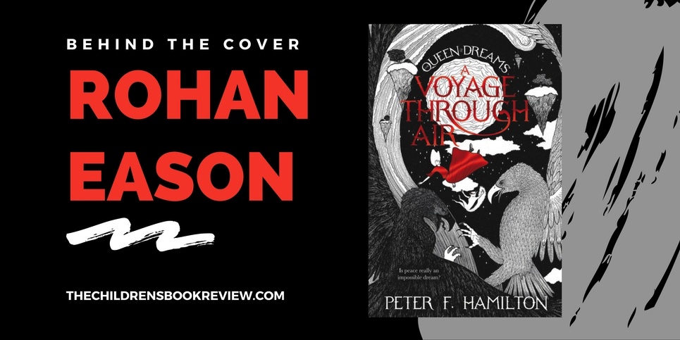
Rohan Eason is an illustrator based in London who works predominantly in pen and ink. His work has been widely used in book illustration, and more recently in advertising and editorial. He is the cover artist of A Voyage Through Air and The Secret Throne, among many other children’s books including My First Kafka, The Gobblings and Wildwitch: Wildfire.
I design because …
I guess the simple answer is I felt I was good at it. I have a lot of artists in the family, and art was always a very important part of my education at home, so it seemed natural to pursue an art career. When I was first started to put an illustration portfolio together, I would always talk to people about my wish to become a children’s book illustrator, and I guess that was enough to take me in that direction. Designing a cover is a wonderful way of condensing and encapsulating thousands of words into one image, I love the organic way reading a book from cover to cover has in creating a defining image. There comes a moment in the book, when all of the characters have substance, the world they inhabit is real, and their journey is at some tipping point or moment of revelation, that the cover image becomes apparent. It doesn’t have to be a dramatic moment, it can be calm, and it may translate into an image that never actually happens in the text, but it represents the moment you understand the book as a whole. This is quite a magical moment, and I enjoy waiting for it to come.
A book cover should …
Portray a feeling, a glimpse into the contract you are about to enter into with the book. It needs to grab the attention of the reader, through ambiguous definition, a suggestion of the journey ahead, without revealing too much of the destination. It’s also important to not over egg a cover, it’s easy to put too much into a cover, but there’s a big difference between interior artwork and a cover, and they should remain very separate entities. A cover needs to be direct in its composition, easily understandable, and confident in its message. That’s why I say ambiguous definition, you don’t know exactly what’s coming, but you’re assured it is coming, and it will be worth knowing when it does.
The latest published book with a cover designed by me is …
Dr Who: Tales of Terror, which also contains 12 full page illustrations by me, which was a real privilege to do. It was a childhood ambition to draw my very own Dalek and Cyberman, and better still create my own Dr Who monster, all of which I got to do for this book. It has been a busy month so far, as my cover for “Brave Red Smart Frog” by Emily Jenkins, publisher Candlewick Press, was also just out, it’s a reimagining of the Grimm Fairytales. I also just had a Myriorama for Laurence King Publishers released this month called the Hollow Woods, it’s a take on the Victorian card games, which allowed you to place a series of landscape images into any order you wanted, they would seamlessly fit together. We turned this idea into a magical story telling game, and the outcome is really fantastic, and a cover design I’m very proud of. Finally, I believe later this month Simon P. Clarks latest book is being released with my cover, so I look forward to seeing that.
My artistic process is …
Sketching sketching sketching, I remember sketching used to be my most hated part of the illustration process, I was always so eager to get down to the final artwork. But over the years I came to realise how important it is. I can sketch one image for a week before I’m happy with the composition and characters, sometimes it can happen in a couple of moves, but how ever it happens, I always know when it’s done. Obviously within the sketching period, I do a lot of research, sometimes this leads me away from my desk, to the library or a museum, perhaps to insect archive, as happened with My First Kafka, but to go out and see and digest is a really important part of the creative process, and I make it a strict part of my method. Finally, when I’m happy with the sketch it’s time to create the final piece, which is probably the most painful and rewarding part of the process, painful because my method requires a great deal of concentration and commitment, and rewarding because I do still get a great deal of pleasure in finishing a work off, like it’s a part of me recorded forever on paper.
My most used creative supply or tool is …
I get through an awful lot of Heavy Duty Sketch pads, I used to use cheaper grade paper when I first started working, thinking it would save me money in my process, but it is imperative that the paper can withstand numerous rubbings out and redraws, and take heavy pencil work without compromising the surface. I never stint on sketch pads. Next up would be my nibs for the ink pens I use, I have draws full of broken nibs, for some reason I can’t show them away, I guess they are my trophies, a sign of how much drawing has been done.
I am inspired by …
Everything and anything. I’ve lived in London for nearly 20 years and it is still a great source of inspiration, not just the galleries, but the people and the streets. When I can I get away to the country, I find the stillness of nature opens my mind to the depth of my passion to create, which can sometimes get trodden on in a big city. It’s important to experience as much of all of life as you can, because what comes out on paper, needs to somehow reflect who and where and when you are, on this planet.
When I’m designing a cover I like to …
Listen to audiobooks. I’m an obsessive listener. I only realised recently how strange my obsession was, as I don’t particularly listen to new books as I work, but have a very small library of classic literature that I listen to on repeat. During a book cover, I may listen to the same story three or four times, and not even notice. I put it down to the nature of my profession, its lonely, I can feel very isolated, and the friendly voices help me feel companionship, and the fact that I know the stories off by heart, means I can focus on my work and not on the voices in my head. It sounds pretty sorry when I write it down, but it keeps me happy and motivated, so each to their own, as they say.
All-time favorite cover of a children’s book I didn’t design …
This is an impossible question for someone who illustrates book covers. I have so many favourites, from the covers of Dr Seuss, to the Yellow book by Aubrey Beardsley, I love the most simplistic covers, I think because my style is inherently complex and detailed, I am drawn to stark and bold covers. I’m a sucker too for the old cloth bound gold embossed books, heavy on the type face, with silhouetted imagery of characters and landscapes. I think I simply have a great love for the medium of books, and the cover is the window into that object, I buy a lot of old books!
A literary classic I would love reissued so I can design a cover for is …
Some of my favourite literature is that of Jules Verne, and to be offered the opportunity to reimagine his works for covers would be a dream. So who ever holds the rights, get in touch, I’m ready.
Currently working on …
I’m currently working on a couple of books, both for US authors, both fully illustrated YA stories. I can’t really say too much, but one is proving to be one of the most emotional journeys I have ever taken with a book project, and the other is full of pirates and adventure, so I am covered for the full spectrum of experience right now, and very happy with it.
—
Connect with Rohan Eason …
www.rohaneason.com | IllustrationWeb | Facebook | Twitter
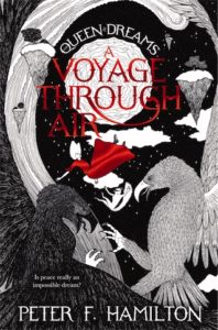
 A Voyage Through Air: Queen of Dreams: Book 3
Written by Peter F. Hamilton
Cover Design by Rohan Eason
Publisher’s Synopsis: War is coming—and every leader of every realm has sided with the War Emperor and pledged to fight the Karrak invaders—apart from Taggie, the teenage Queen of Dreams-to-be. Aided by an unusual band of allies, including a Karrak Lord, an elf and a feisty skyfolk captain, Taggie knows that the only way to stop the war is to find the long-lost gateway between our universe and the dark universe: the home of the Karrak people. But how much is Taggie willing to lose in her desperate quest for peace?
Ages 9-12 | Publisher: Pan Macmillan | 2017 | ISBN-13: 978-1447291169
Available Here:
Discover more book cover design inspiration and books like A Voyage Through Air, written by Peter F. Hamilton and cover design by Rohan Eason, on The Children’s Book Review by following along with our Behind the Cover series and articles tagged with Middle Grade Books.

